UICollectionView CompositionalLayout Part 5: Orthogonal Scrolling
A visual look at all of the different options for this feature your users are sure to love
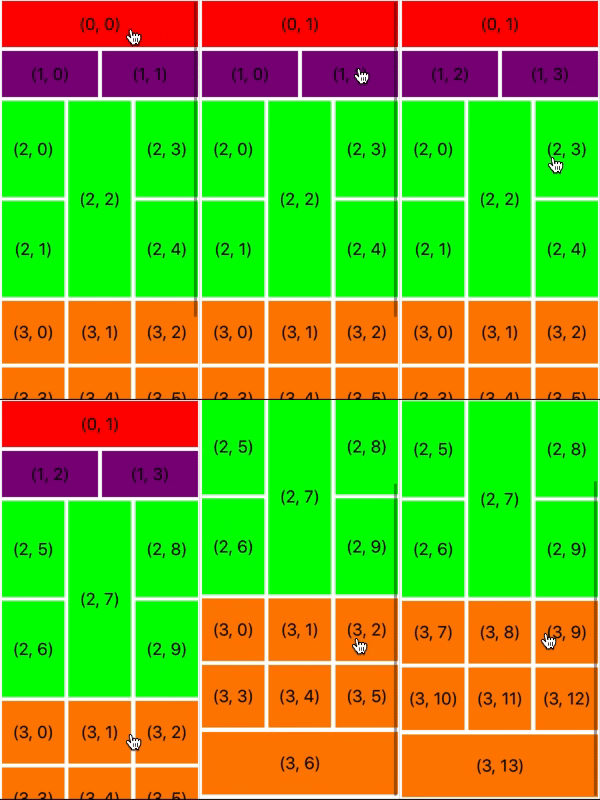
With UICollectionViewCompositionalLayout, achieving this complex effect couldn’t be simpler. Let's take a look at how this is done and what kinds of options for orthogonal scrolling we have.
Just like Apple did in the App Store app, we used orthogonal scrolling in the layouts we have been working on throughout this series. This sophisticated feature is achieved by changing the value of the orthogonalScrollingBehavior property on our NSCollectionLayoutSection objects. This property is a UICollectionLayoutSectionOrthogonalScrollingBehavior type, which is an enum with 6 cases. Let's take a look at each one in a little more detail.
We will use the same layout throughout this SwiftTip to better demonstrate how each of the 6 options differ. Our layout will be a slightly modified version of the second layout from the earlier parts of this series. This time around the cells' text will contain their group index and the groups will alternate colors between green and purple. The height of each cell is a bit bigger and the width of the groups has been reduced to make things more clear.
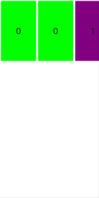
First, let's take a look at the continuous option. This option provides us with the same scrolling seen by default in a collection view or a table view.
section.orthogonalScrollingBehavior = .continuous
Next there is continuousGroupLeadingBoundary. This one also scrolls similarly to how a collection view or a table view scrolls but the scrolling only stops at the leading edge of a group, unless you scroll all the way to the end.
section.orthogonalScrollingBehavior = .continuousGroupLeadingBoundary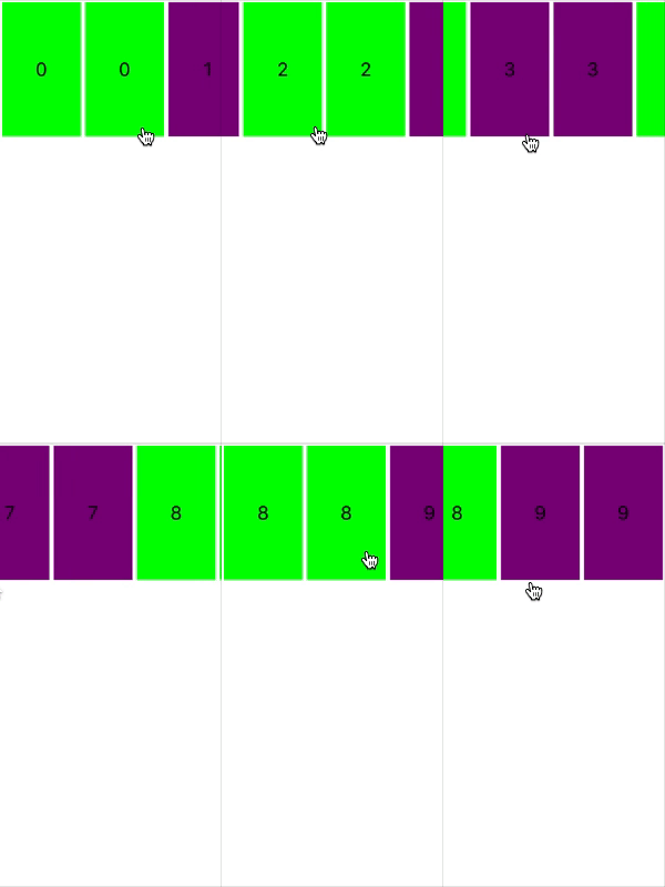
paging is another option for the orthogonalScrollingBehavior property. The collection view moves in pages. Each page’s size is determined by the collection view's bounds. In our example, the width of each page is equal to the width of the collection view.
section.orthogonalScrollingBehavior = .paging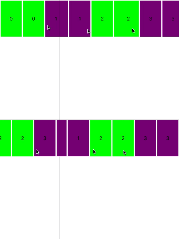
We have two other types of paging behavior available to us. The first one being groupPaging. Here, instead of the page size being determined by the collection view, it is determined by the section's group. If your section where to use nested groups, the page size would be determined by the top level group, the one you give to the NSCollectionLayoutSection initializer.
section.orthogonalScrollingBehavior = .groupPaging
The final type of paging behavior is groupPagingCentered. With this one, groups are again what determine the page sizes but instead of the pages scrolling so the groups line up with the leading edge of the collection view, they are centered in the collection view.
section.orthogonalScrollingBehavior = .groupPagingCentered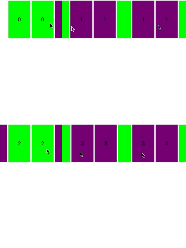
The last of the 6 values we can set for orthogonalScrollingBehavior is none. If none is used, there is no orthogonal scrolling and items in a section are laid out in the same direction as the collection view as a whole scrolls.
section.orthogonalScrollingBehavior = .none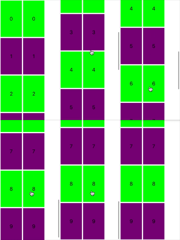
Full Code
import UIKit
import PlaygroundSupport

class MyViewController : UIViewController {

    override func loadView() {
        let view = UIView(frame: CGRect(x: 0, y: 0, width: 375, height: 667))
        self.view = view

        setUpCollectionView()
    }

    func setUpCollectionView() {

        let layout = UICollectionViewCompositionalLayout(section: layoutSection())
        let collectionView = UICollectionView(frame: .zero, collectionViewLayout: layout)

        collectionView.translatesAutoresizingMaskIntoConstraints = false

        collectionView.backgroundColor = .white

        collectionView.register(Cell.self, forCellWithReuseIdentifier: "Cell")
        collectionView.dataSource = self

        view.addSubview(collectionView)
        collectionView.topAnchor.constraint(equalTo: view.topAnchor).isActive = true
        collectionView.trailingAnchor.constraint(equalTo: view.trailingAnchor).isActive = true
        collectionView.bottomAnchor.constraint(equalTo: view.bottomAnchor).isActive = true
        collectionView.leadingAnchor.constraint(equalTo: view.leadingAnchor).isActive = true
    }

    func layoutSection() -> NSCollectionLayoutSection {

        let itemSize = NSCollectionLayoutSize(widthDimension: .fractionalWidth(0.5), heightDimension: .fractionalHeight(1.0))
        let item = NSCollectionLayoutItem(layoutSize: itemSize)
        item.contentInsets = NSDirectionalEdgeInsets(top: 2.0, leading: 2.0, bottom: 2.0, trailing: 2.0)

        let group = NSCollectionLayoutGroup.horizontal(layoutSize: NSCollectionLayoutSize(widthDimension: .fractionalWidth(0.75), heightDimension: .absolute(125.0)), subitems: [item])

        let section = NSCollectionLayoutSection(group: group)
        // Only use 1 of these 6 options at a time
        section.orthogonalScrollingBehavior = .continuous
        section.orthogonalScrollingBehavior = .continuousGroupLeadingBoundary
        section.orthogonalScrollingBehavior = .paging
        section.orthogonalScrollingBehavior = .groupPaging
        section.orthogonalScrollingBehavior = .groupPagingCentered
        section.orthogonalScrollingBehavior = .none

        return section
    }
}

extension MyViewController: UICollectionViewDataSource {

    func collectionView(_ collectionView: UICollectionView, numberOfItemsInSection section: Int) -> Int {
        return 20
    }

    func collectionView(_ collectionView: UICollectionView, cellForItemAt indexPath: IndexPath) -> UICollectionViewCell {

        let cell = collectionView.dequeueReusableCell(withReuseIdentifier: Cell.resuseIdentifier, for: indexPath) as! Cell

        let groupIndex = indexPath.row / 2
        cell.label.text = "\(groupIndex)"
        if groupIndex.isMultiple(of: 2) {
            cell.backgroundColor = .green
        } else {
            cell.backgroundColor = .purple
        }

        return cell
    }
}

class Cell: UICollectionViewCell {

    static let resuseIdentifier = "Cell"

    let label: UILabel = {
        let label = UILabel()
        label.translatesAutoresizingMaskIntoConstraints = false
        label.textAlignment = .center
        return label
    }()

    override init(frame: CGRect) {

        super.init(frame: frame)

        addSubview(label)
        label.topAnchor.constraint(equalTo: topAnchor).isActive = true
        label.trailingAnchor.constraint(equalTo: trailingAnchor).isActive = true
        label.bottomAnchor.constraint(equalTo: bottomAnchor).isActive = true
        label.leadingAnchor.constraint(equalTo: leadingAnchor).isActive = true
    }

    required init?(coder: NSCoder) {
        fatalError("init(coder:) has not been implemented")
    }
}

PlaygroundPage.current.liveView = MyViewController()
* This article originally appeared in the ZipTips app.
